Custom T-Shirt Colour Matching: Screen vs Print
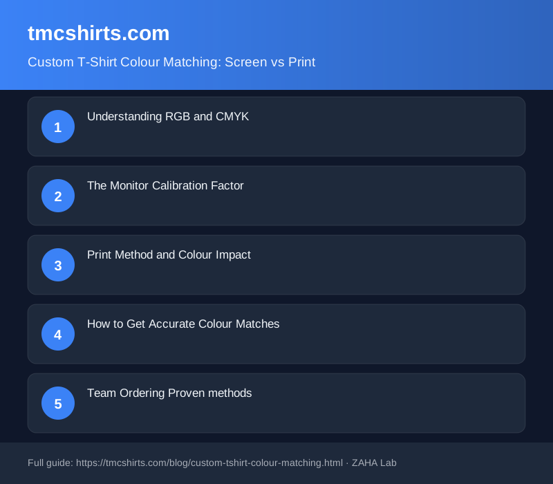
You've chosen the perfect shade of blue for your team design on screen. The colour looks crisp and professional. Then your custom t-shirts arrive, and the print is nothing like what you expected. Your screen displays colours in RGB (red, green, blue) light, whilst printed t-shirts use CMYK (cyan, magenta, yellow, black) inks. These two fundamentally different colour systems rarely match perfectly without careful management and planning.
Understanding RGB and CMYK
Your screen emits light in RGB colour mode. It creates colour by combining red, green, and blue light at various intensities, producing a vastly larger range of displayable colours than any print medium can achieve. CMYK printing, used by screen printing and DTG printers, relies on mixing physical inks instead. Bright, neon-like colours that pop on your monitor cannot be reproduced exactly on fabric because the ink system cannot produce them with the same intensity.
Consider a vibrant teal. Your screen shows this by blending bright blue and green light. A printer mixing cyan and yellow inks produces teal, but it looks duller and more muted because physical ink reflects light differently than an illuminated pixel.
The Monitor Calibration Factor
Even within RGB, your specific monitor affects what you see. An uncalibrated screen may display reds that are too saturated or greens that are too dim compared to other monitors. If your designer uses a colour-calibrated display and you review the file on an average laptop screen, you are literally seeing different colours. This is why professional designers often calibrate their monitors and why your printer may not match your on-screen preview exactly.
Print Method and Colour Impact
Screen printing and DTG produce colours differently. Screen printing uses pre-mixed Pantone inks applied through screens, whilst DTG sprays CMYK inks directly onto the fabric. Screen printing can produce more vibrant colours if a custom Pantone is mixed to your specification, but requires separate screens for each colour, raising costs. DTG is more cost-effective for multi-colour designs but relies on CMYK limitations.
Fabric colour and material also matter significantly. A dark navy t-shirt makes any print look darker than the same design on white. Polyester reflects light differently than cotton, affecting perceived colour saturation and vibrancy.
How to Get Accurate Colour Matches
Use Pantone colour specifications whenever possible. Instead of describing a colour as "the blue on my screen," specify a Pantone number like Pantone 2935C. Your printer can then mix or refer to that exact standard, eliminating guesswork and interpretation differences. If you are using DTG printing, provide your file in CMYK mode rather than RGB to guide your printer toward the colours you intend.
Always request a sample before bulk production. Ordering a single test shirt or sample batch costs far less than discovering a colour mismatch across 100 shirts. This gives you the chance to adjust before committing to full production and spending significantly.
Communicate your expectations clearly. Tell your printer whether you need exact colour matching or whether you can accept slight variation. Some projects tolerate flexibility, others demand precision. Being explicit upfront prevents frustration when shirts arrive.
Team Ordering Proven methods
For large team orders spanning multiple locations or departments, centralise artwork approval through one person with access to a properly calibrated screen, if possible. Invest time in the sample approval stage. A twenty-pound sample order beats a crisis when thousand-pound orders arrive with incorrect colours or mismatches between designs.
FAQ
Why does my colour look different on my phone than my computer?
Different screens have different colour profiles and brightness settings. Your phone likely has a different colour temperature and brightness than your desktop monitor, which shifts how colours appear. Always review design files on the same device you used to create them when possible.
Can a printer match any colour I show them on screen?
No. Printers cannot match all on-screen colours because the RGB colour gamut is larger than what CMYK inks can produce. Extremely bright, neon, or highly saturated colours are often impossible to reproduce exactly. Use Pantone colours or request a colour-matched sample to verify feasibility.
Is screen printing better than DTG for colour accuracy?
Screen printing can produce more vibrant colours if a custom Pantone ink is mixed, but it is more expensive and requires separate screens for each colour. DTG is faster and better for multi-colour designs but uses CMYK, which limits colour saturation. The best choice depends on your design complexity and budget.
How do I ensure colour consistency across a large team order?
Use Pantone colour specifications, approve a sample before bulk production, and have your printer document the exact ink mix or settings used so future re-orders match. Keeping t-shirt colour consistent (navy, white, etc.) also helps, as lighter fabrics show printed colours differently than dark ones.
Should I convert my design to CMYK before sending to the printer?
Yes, if you are using DTG printing. Converting to CMYK mode before sending helps your printer see colours in the format they will print in. For screen printing, provide RGB but reference Pantone numbers for critical colours to ensure accurate mixing and reproduction.